Storm’s Nail Salon

About

For a class project, I was paired up with a student from the business management department. My task was to create a logo and branding guide for their business.That student had a business that they created either for the project or an actual business they had. I was paired up with a lady named Storm who created a nail salon for this project entitled “Storm’s Nail Salon”. We met up for our first discovery meeting in the middle of October to discuss her vision for the business branding.

Tools Used

Illustrator

Photoshop

InDesign

Project Type

Client / School Project

Year

2022

Client’s Expectations

Our goal for this assignment was to create the logo and branding guide by the second week in November. Storm and I decided to meet every Tuesday leading up to the deadline to make sure I was on the right track with her vision. 

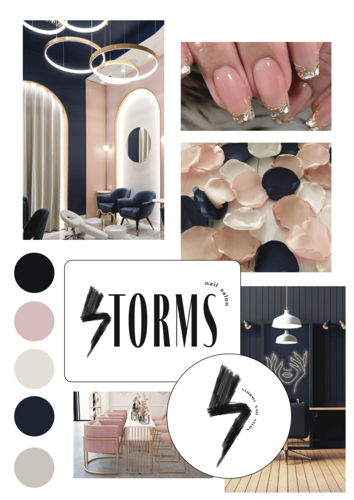
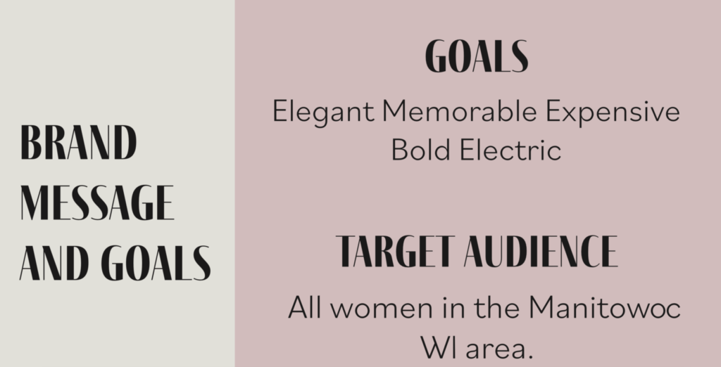
When working with Storm in the beginning I found it hard to find what she wanted because she was so open to my creativity. So to help narrow down ideas I had her pick from a list of adjectives that she wanted her brand to portray. She chose elegant, memorable, expensive, bold, and electric. Along with that, she stated that her target audience is all women in the Manitowoc area. She also mentioned that she wanted a lightning bolt incorporated somewhere to go with her name. With this information, I created 3 mood boards with colors, inspirational images, and rough logo mockups.
Design Process: Meeting 1

For the mood boards, I had one that had pink neutral tones, one with gray tones, and lastly one with a mix of both with a navy blue mixed in. Storm liked the last mood board the best because I included a navy blue that went with her name. She also mentioned that she liked how I kept it neutral and calm for the elegant spa feel. 

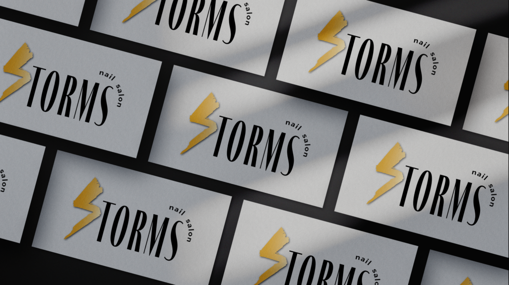
Along with the colors and inspirational images in the mood boards I included rough sketches of logos because of the time restraint we had. I went with a simple typography-heavy design to keep it sleek and elegant and added lightning bolts in either to frame the compositions or to include in the typography. The design Storm chose ended up being my favorite as well. The design is just her name with the “S” as a lightning bolt and “nail salon” off to the side. From there she mentioned that she would like some yellow in the designs so from there I finalized the logo and color pallet for our next meeting.

Design Process: Meeting 2

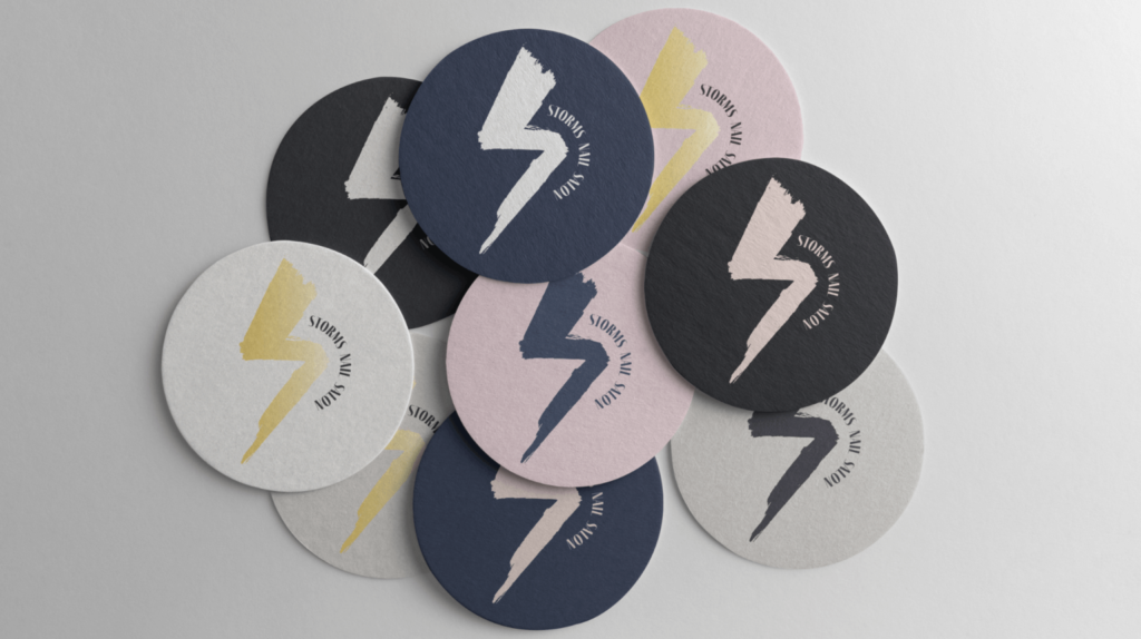
For our second-to-last meeting, we went over the almost finalized designs. I made the ‘S’ in her name gold to incorporate the yellow that she wanted, and re-arranged the ‘nail salon’ type to balance out the design. I also made a secondary logo to put on smaller mockups if needed. For this design, I used the same ‘S-shaped lightning bolt and I arranged the name of the salon similarly to the main design by wrapping it around the lightning bolt. She was really happy with this result but the only thing she mentioned was to make the ‘S’ a little bigger for the rest of her name. From there I asked what types of mockups she would like and once again we were at a standstill in coming to a decision. She said “Anything you do will be fine.” So with that information, I prepared for our final meeting.

Design Process: Final Meeting

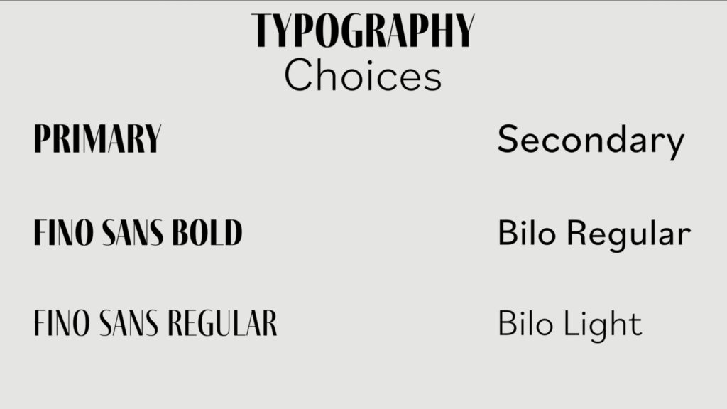
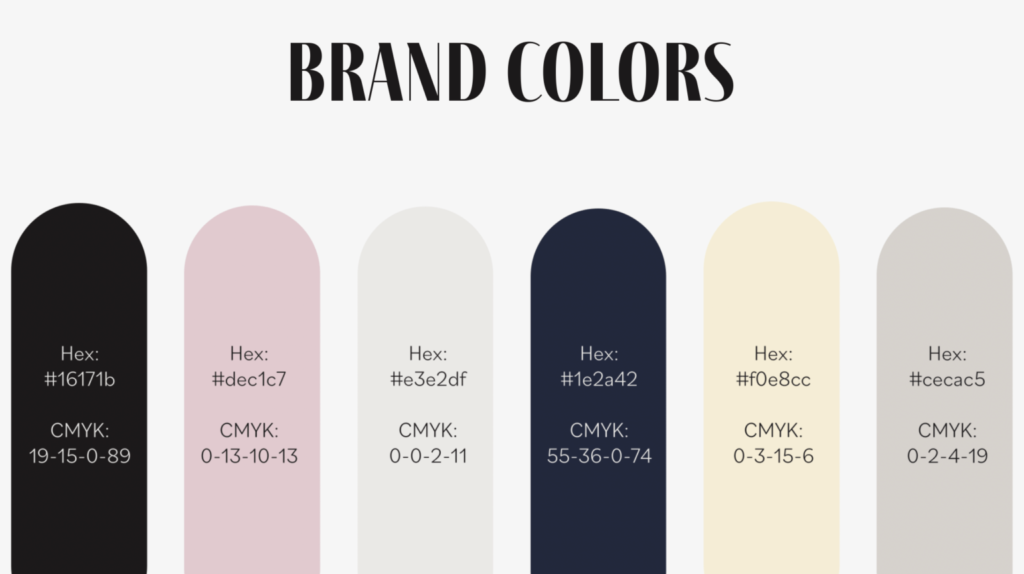
For the final meeting, I put together a branding guide presentation. This is probably the longest part of this process because I am such a detail-oriented person. I took a lot of time to make sure everything was laid out correctly and looked very professional. In the branding guide, I went through the process of how we got to the result. I reviewed our goals and showed her the mood boards. Then I went into the final brand colors on one slide and the typography on another. For the typography slide, I showed which font should be used as the primary and which should be used as the secondary. After that, I showed the final logos which she was very happy with. I described how she can use the logos with dark and light backgrounds while still using her brand colors. Then for the final part of the presentation, I showed her the mockups. The first one is a business card, and the second has the secondary logo with the design on coasters with different variations of the brand colors. Storm was elated when I showed her these mockups stating “This is exactly what I wanted!”. With that information, I can conclude that my first project with a client was a success.

Challenges

Although the project ended up a success it doesn’t mean there weren’t challenges along the way. One is the tight time restrictions. Due to the client missing a meeting, we had one less week to meet which caused me to make the logo mockups along with the mood boards which was challenging because of the lack of direction from the first meeting. I ended up using the adjectives she used to describe her business and the main inspiration for the logos which ended up working out. Throughout the process, I realized how to ask questions better to get clarification on the desired outcome my client wanted.