Serenity Springs

About

The Serenity Springs Resort project, undertaken as part of a class assignment, involved the creation of a brand identity for a tranquil and rejuvenating resort experience. This case study explores the design choices, including the development of custom illustrations, color selection, typography, and the establishment of consistency, all aimed at capturing the essence of Serenity Springs and inviting guests to embark on a serene weekend getaway.

Tools Used

InDesign

Illustrator

Photoshop

Project Type

School Project

Year

2023

Design Approach
& Brand Creation:

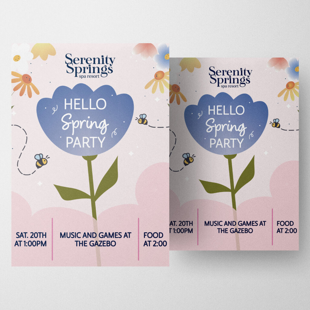
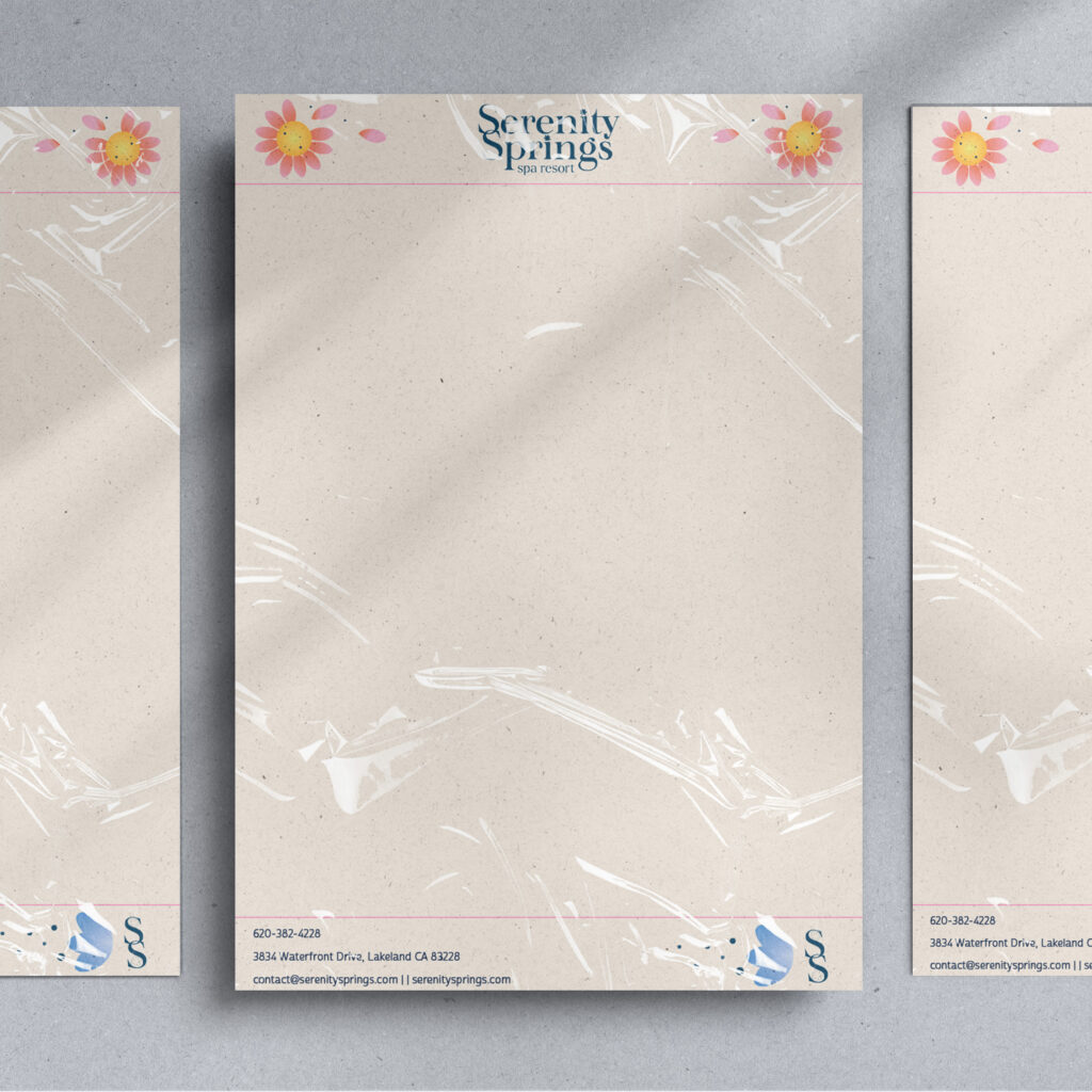
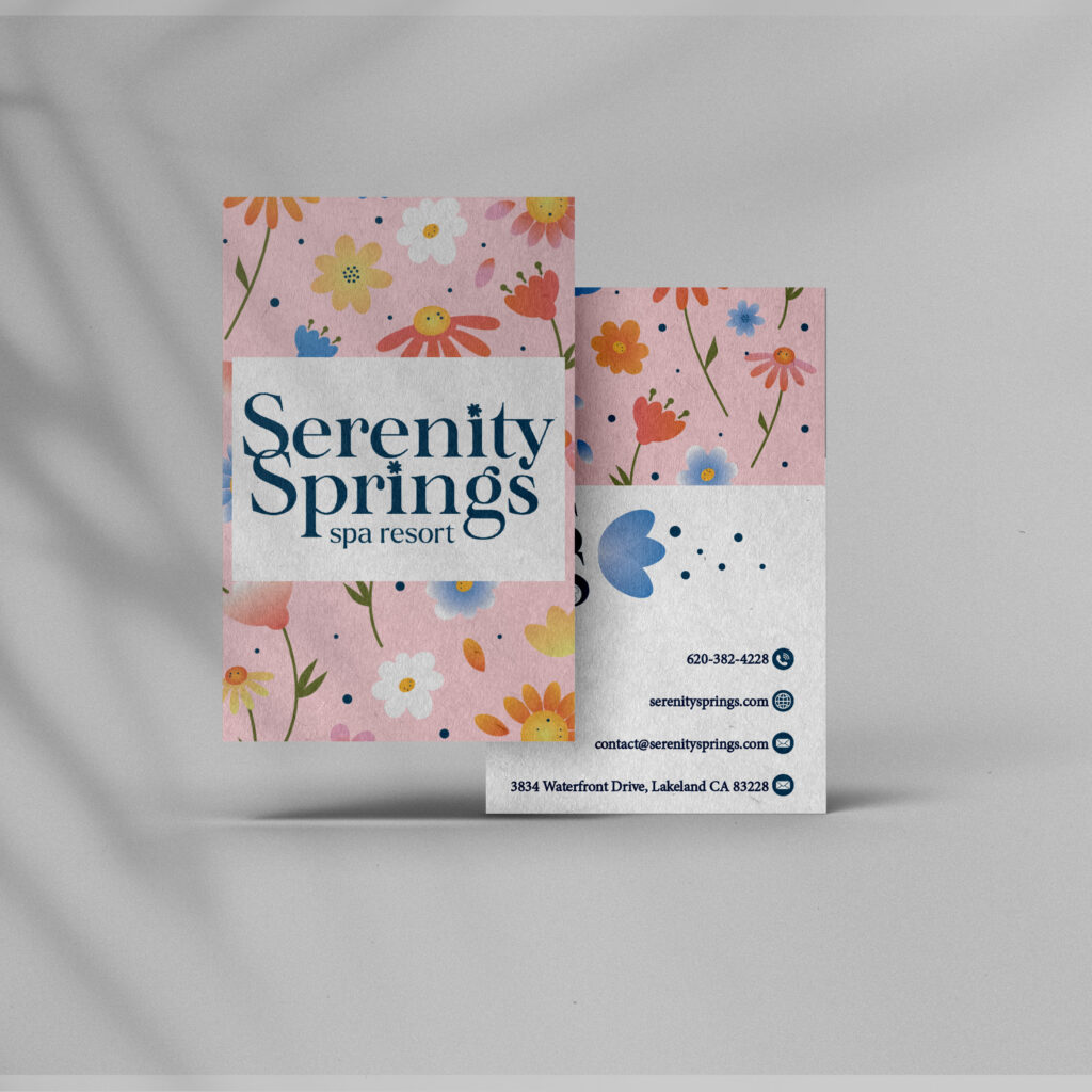
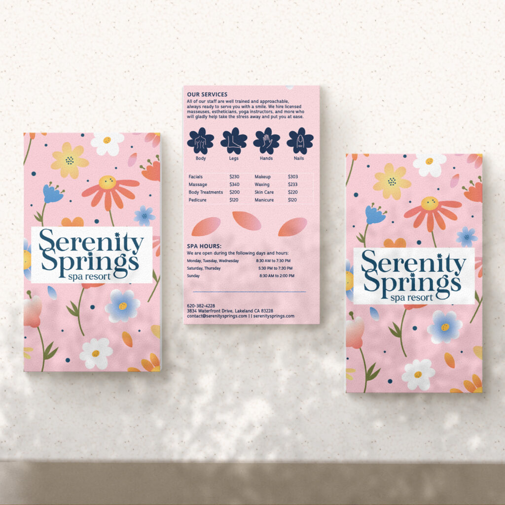
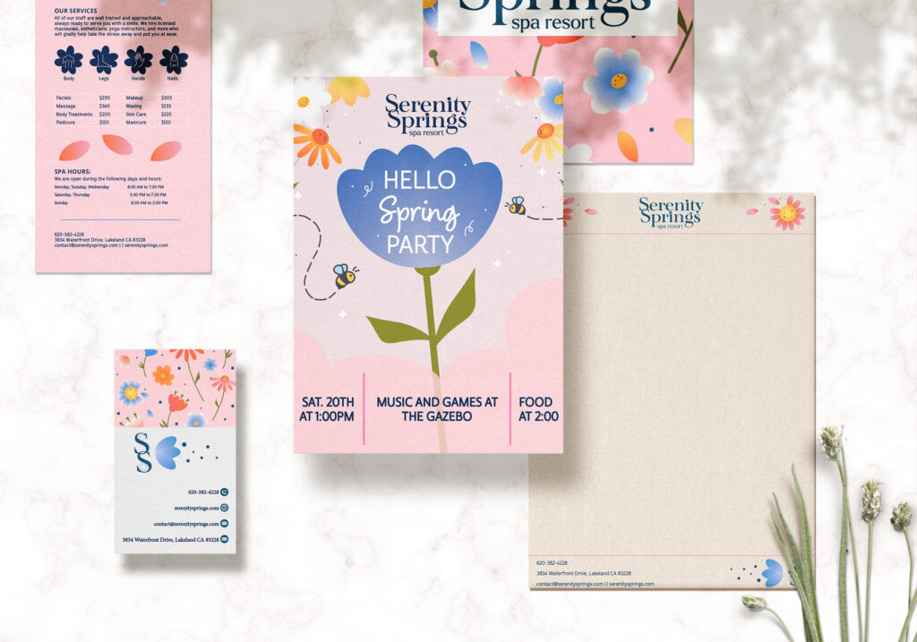
As the creator of the Serenity Springs Resort brand, the design choices were driven by the desire to provide a relaxing and immersive experience for visitors. The resort’s theme of relaxation, tranquility, and weekend getaways served as the foundation for the design process. Custom illustrations played a pivotal role in visually storytelling and capturing the natural surroundings of the resort. Handcrafted illustrations of flowers and nature were meticulously developed to enhance the marketing materials, inviting guests to envision themselves in the peaceful oasis of Serenity Springs.

To bring the brand to life, various marketing collaterals were created using Adobe InDesign. The project included designing a flyer, letterhead, business card, and rack card. These materials served as essential touchpoints for guests to engage with and learn about Serenity Springs.

Flyer:

The flyer design incorporated the custom illustrations, vibrant colors, and elegant typography. It effectively conveyed the resort’s offerings, amenities, and the unique experience guests could expect during their stay.

Letterhead:

The letterhead design ensured consistency with the overall brand identity. It featured the Serenity Springs logo, typography, and a subtle integration of the custom illustrations. This cohesive design enhanced the professionalism and credibility of the resort’s correspondence.

Business Card:

The business card design incorporated key brand elements such as the logo, typography, and custom illustrations. The design aimed to leave a lasting impression and provide guests with essential contact information, reinforcing the resort’s brand identity.

Rack Card:

The rack card design served as an informative and visually appealing promotional material. It showcased enticing imagery, captivating custom illustrations, and concise information about Serenity Springs’ unique offerings. The design enticed potential guests and encouraged them to learn more about the resort.

Conclusion:

The Serenity Springs Resort project, developed as a class assignment, successfully created a brand identity that encapsulated the resort’s serene and immersive experience. Through the incorporation of custom illustrations, vibrant colors, and carefully selected typography, marketing collaterals such as the flyer, letterhead, business card, and rack card were designed in Adobe InDesign. These materials effectively conveyed the resort’s offerings and enticed potential guests to embark on a rejuvenating getaway. By maintaining consistency and cohesiveness throughout the design process, the marketing collaterals reinforced the brand’s recognition and invited guests to experience the tranquility, joy, and rejuvenation of Serenity Springs.