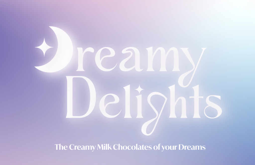
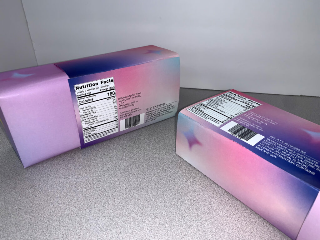
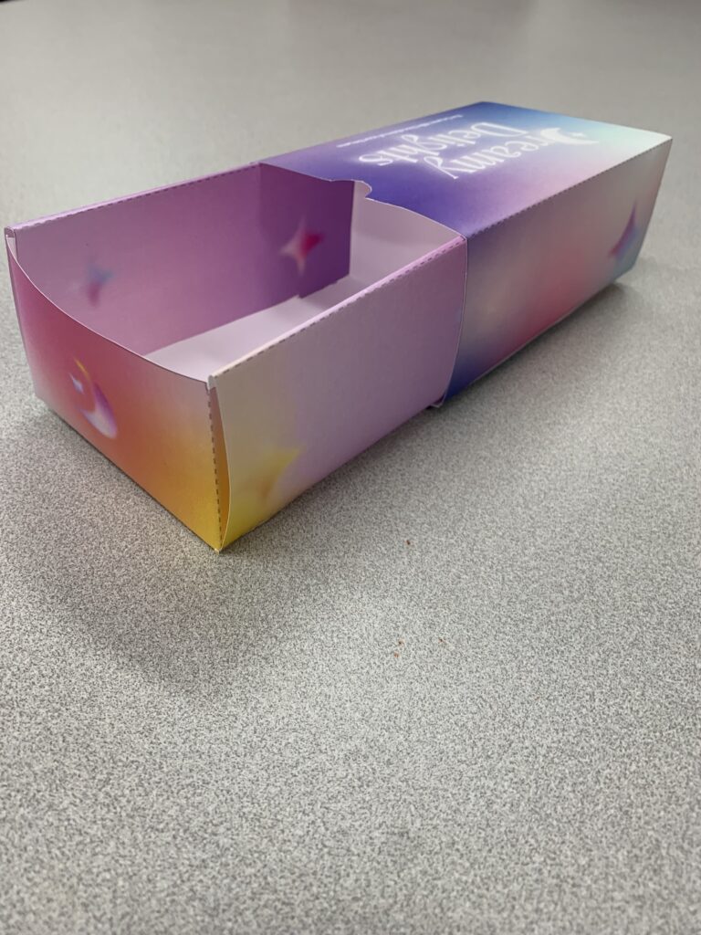
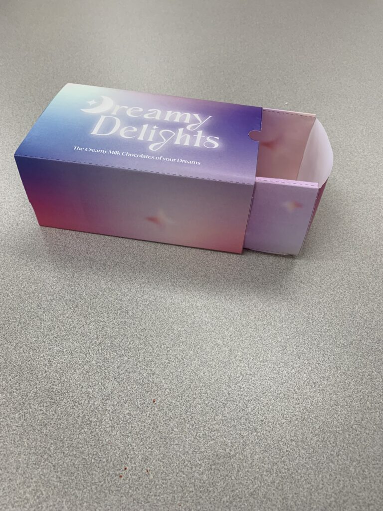
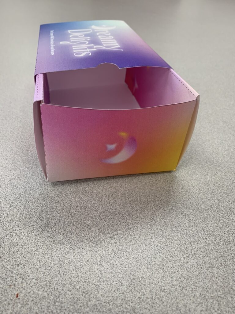
To bring the dreamy feel to life, gradients were strategically incorporated throughout the packaging design, based on the type of chocolate. Each variant boasts its own unique gradient, with the white chocolate package featuring a light gradient, the dark chocolate package showcasing a deeper and darker gradient, and the milk chocolate package, the focus of this case study, employing a balanced and captivating gradient. Complementing the gradients, the cornerstone of Dreamy Delights’ branding is a handcrafted font used in the main logo. This distinctive font adds a personal and artisanal touch, effectively capturing the brand’s commitment to quality and craftsmanship. Positioned as the focal point, the logo prominently graces the packaging, establishing brand recognition.